Low-Contrast Sensory Sanctuary
A black-and-white photograph. A striped duvet cover. Bold text on a bright background. For some autistic people, looking at strong visual contrast does not register as neutral. It can trigger genuine physical discomfort — a jolt, a wave of nausea, an urge to look away immediately. This is not being fussy about decor. It is a measurable difference in how the visual cortex processes contrast, and it has direct consequences for whether a bedroom feels safe to relax in.
A low-contrast sensory sanctuary is not about matching neutral tones for aesthetic reasons. It is about removing a specific category of visual input that some nervous systems process as genuinely more intense than others do.
Why Contrast Specifically
Your visual cortex processes contrast — the difference between light and dark areas of what you see — as one of its most basic building blocks. In most nervous systems, response to contrast increases gradually and then levels off. Studies measuring brain activity in autistic participants find something different: response amplitude keeps climbing as contrast increases, well past the point where a neurotypical visual system would plateau.
This is not a preference or a sensitivity in the vague sense. It shows up directly in activity, measured with EEG, correlated with how much sensory difficulty people actually report. A striped pattern or a stark black-on-white image is not just visually busy — it is a stronger neurological event.
High contrast → disproportionate visual cortex activation → genuine physical discomfort, sometimes including nausea or an urge to look away — not a subjective dislike, but a measurably different neural response to the same input.
Not everyone in the AuDHD spectrum needs the same environmental changes — the underlying reason a busy room feels wrong differs by profile.
ADHD’s relationship to visual environment is different in kind — less about contrast processing specifically, more about difficulty filtering competing visual input. A cluttered or visually busy room pulls attention away from rest the same way it pulls attention away from any task. The mechanism is attentional competition, not sensory intensity.
AuDHD can combine both mechanisms: contrast that is genuinely more intense to process, in a room that is also fighting for attention through clutter or visual complexity. The two problems compound rather than simply adding — a low-contrast room that is still visually busy addresses only half the picture.
The contrast-processing difference is the most directly evidenced mechanism here. Roughly half of autistic people in one EEG study showed contrast responses beyond the range of any neurotypical participant tested — a genuine outlier pattern, not a mild average shift.
Building the Sanctuary
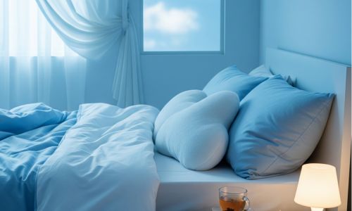
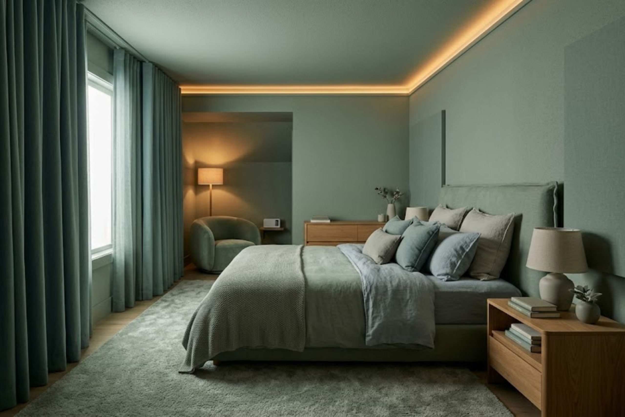
- Choose bedding and walls within a similar tonal range — soft mid-tones rather than stark white against dark, or bold pattern against plain.
- Avoid high-contrast stripes, checks, and busy geometric prints in the immediate sleep environment specifically, even if you tolerate them elsewhere.
- Match curtain and wall tones closely, so the window does not become a stark light-dark boundary at dawn or with streetlight.
- If full redecoration is not possible, start with what touches your body directly — duvet cover and pillowcase — since that is the visual field closest to you at the point of trying to rest.
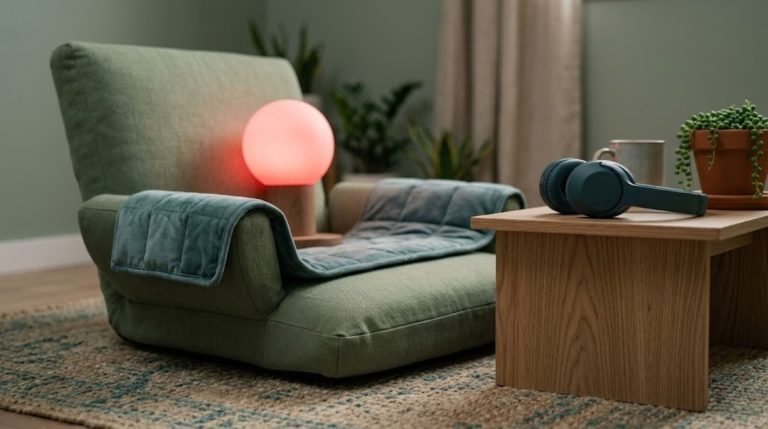
- Warm, dimmable lighting rather than a single bright overhead source — harsh top-down light creates strong shadow contrast across the room.
- Avoid fluorescent bulbs specifically — both flicker and colour temperature add to visual load beyond contrast alone.
- A single warm lamp at a low level, rather than multiple light sources at different heights and colour temperatures.
- If ADHD-related visual competition is your main pattern, prioritise reducing the number of visible objects, not just their contrast.
- Closed storage over open shelving keeps visual busyness out of the room without requiring the objects themselves to disappear.
- A designated single spot for the next day’s essentials avoids scattering visible items across multiple surfaces.
Not everyone experiences clutter as impairing in the ways they expect. One study found that room clutter did not reliably interfere with measured attention performance, even in people who reported feeling distracted by it. Subjective discomfort and measured performance do not always move together — if a tidy room helps you feel calmer even without a measurable performance change, that is still a legitimate reason to keep it tidy.
A low-contrast room is one part of the wider sensory environment. If you are building this out fully, our guides on building a midnight sensory nest and low-light activities for the midnight watch cover the rest of the environment for AuDHD waking hours.
- 1Some autistic people show a measurably disproportionate response as contrast rises — a genuine neurological difference, not a preference.
- 2ADHD’s relationship to visual environment is different in kind — attentional competition from clutter, not contrast-specific processing.
- 3Low-contrast does not mean beige or sterile — it means keeping tones close together, colour is still available.
- 4Lighting shapes perceived contrast as much as colour choice does — warm, single-source, dimmable light matters alongside wall and bedding tone.
- 5Contrast and clutter are separate problems needing separate fixes — know which one is actually driving your discomfort before redecorating for the wrong one.